Meet Canada 150, Canada's New Typeface
Posted on Monday, December 14, 2015, 08:33 AM, by Ryan Hussey, under
Canada News
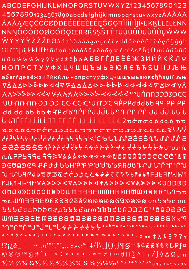
To celebrate Canada's 150th birthday, a typographer named Raymond Larabie has designed a font to unify the country's various cultures.
According to an article in Wired, the font brings together Latin characters of the English and French languages with the syllabic characters of Canada's indigenous dialects. Larabie claims his goal was to create a typeface that was "inclusive," to bring together the different cultures of a great nation.
"I just thought, well it's a birthday present for Canada," he said. Canada 150, however, is not the country's first semi-official font. A typographer named Carl Dair designed a typeface called Cartier in 1967, which was the first Latin character font created in Canada. In fact, the governor general commissioned the typographer to design the font for Canada's 100th birthday. Dair spent about ten years working on it.
A designer at Rosetta Type Foundry named David Brezina has stated that designing a typeface using multiple scripts can be extremely difficult. It is an in-depth process that requires a deep understanding of each script involved because you need to make them work together without taking away from any of them. We believe that Larabie has done that with Canada 150, or at least made progress to finding something that truly blends all of the many cultures of the country together. The font combines humanistic and geometric features -- something Larabie has called "pragmatic" because it doesn't look "tough and imposing." And that's exactly how a font should look.
1021fcb5-3c18-4715-9589-4e53651129c7|0|.0|43d7d415-1ae5-4d2c-9818-43ef12e66ebc
Tags : canada, culture